A convention is a traditional way of laying out a magazine, for example the mast head is usually in the top left hand corner. Magazines generally follow conventions because it allows people to read the magazine without the extra effort of a change to the normal layout – magazines without a contents page on the inside of the cover for instance would probably be harder to navigate until you were used to the layout of that particular magazine. However, a change from the normal conventions can look interesting and appeal to those who think of themselves as ‘edgy’ which could be a clever marketing ploy in a society where music magazine sales are dominated by youths.
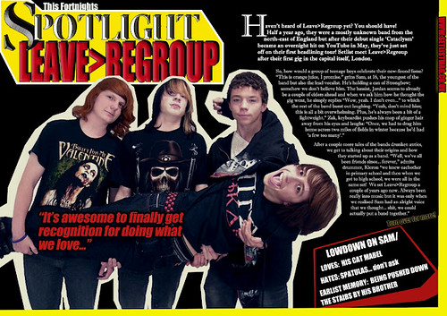
The title of my magazine: ‘SETLIST’ connotes that it is a music magazine and that it is for young people who enjoy going to gigs regularly. The font 'Femoralis' I used for the masthead and the effects I put on the text make it look like chiselled rock or metal which fits the overall style of the magazine in being unique and attention grabbing just like the target audience. ‘SETLIST’ was produced to fit into an alternative/indie rock genre and I drew inspiration from magazines such as NME and Kerrang especially; I think my magazine represents this genre through the use of band's mentioned and the appearance of the bands featured. I didn't use any props in my photographs of the band's - I did think about borrowing instruments for Leave>Regroup but I didn't know anyone who had drums I could use - so I left the focus entirely on the band members and I thought it turned out well. As all of the people I picked to be in the band are pretty much part of my target audience I didn't have to tell them what to wear as they know how alternative rock bands generally dress. I liked the idea of creating a magazine based around NME because it has such a good reputation, has a large young-adult audience and its house style is very well developed; however when I actually brought a copy, I found it a bit ‘grown up’ and not as fun as I’d like my magazine to appear. It could have just been the newspaper pages inside the glossy cover, but I found it lacked the attention grabbing look that Kerrang maintains all the way throughout. When I looked at a couple of issues of Kerrang, I found its contrasting colours, slightly off-kilter pictures & shapes and overall more ‘edgy’ feel appealed more to my personal taste and what I think my target audience would find appealing. However, I much preferred the way the articles inside NME were written, so I decided to use this style of writing on my double page spread. I think I used language suited to my audience such as swearing which is common in the age group I am targeting.
I used Flickr to make notes on how each page of Setlist follows or breaks conventions. Click on the images below to see these notes.
I used Flickr to make notes on how each page of Setlist follows or breaks conventions. Click on the images below to see these notes.


Overall, I think my magazine fits the Alternative/Indie Rock genre well and that it caters for my target audience with its house style. I think although there are lots of other music magazines already in the market, that Setlist would be able to flourish as a more mature alternative to Kerrang. Kerrang has been around for a long time and I think Setlist is a more up-to-date version of it, with a twist because it also caters for a more 'indie' audience too.
No comments:
Post a Comment