College Magazine:For the preliminary task I only used Photoshop. Apart from a small task involving making a album cover, this was my first experience of Photoshop so I learnt a lot about it and the effects it can produce, such as using the magic wand tool to crop photos more effectively, how to change the opacity on a top layer so it merges with the one underneath and how to use filters such as gaussian blur or lighting so you can have spotlights to highlight aspects of the finished product. As I had very little knowledge of Photoshop, my college magazine cover and contents were a mix of as many different effects as possible and so it didn't turn out as well as I would have liked it to. However, this preliminary task did give me a chance to try out all the different things that Photoshop has to offer so when it came to the main task I had a much better idea of what I wanted to achieve and how to achieve it.
Main Task & The Evaluation Labels:
When it came to creating my music magazine and evaluating it, I used a variety of free, online software including:
Blogger- I used Blogger to present all my coursework in a tidy, easily accessible way and although I already have some experience of it because I read blogs anyway, I did learn a couple of things. One of these was how to link videos and power-points into the blog post so they show up using the HTML code. I had no idea of what they were or what they are used for until constructing my blog.
Survey Monkey - I used Survey Monkey to create questionnaires to collect information about my target audience. I haven't learnt anything specifically from it apart from how to navigate the site and that if a computer has already been used once to complete the survey, you can't reuse it which is helpful when trying to make sure different people take the survey but annoying when somebody tries to use the same computer as the other people who have filled it in.
Da Font - I used this to find the font for the masthead of SETLIST and I learnt how to download font's and get them to work in Photoshop although because I downloaded them at home, when using the font 'Femoralis' from this site it didn't show up as a font; only as image so it's lucky I'd already decided what I wanted to be my masthead.
Flickr - I uploaded photos to Flickr so I could make notes on them which means that someone reading my analysis of a picture can easily see which part of the image I'm referring too and because all the information comes up on the picture when you hover over it you don't have to scroll up and down the page to see what I said and whether it does apply to the image.
Slide Share - After creating a power-point, I uploaded it to Slide Share which meant I could use the HTML code to make the power-point show up on my blog which provided a change from just reading a blog post of text.
Youtube - I'd already had experience with Youtube because I watch videos on it regularly, however I hadn't uploaded anything before so I guess I learnt how to do that even though it was a fairly simple process.
However, there are advantages and disadvantages to using online software as I displayed in the picture below.
As well as this online software I used programmes on the computer, such as:
Power-Point - I already had lots of experience with this because we used to use it a lot at high school, so I didn't learn much from it; it was very helpful because it enabled me to use Slide Share though.

Windows Live Movie Maker - Although I'd had a little experience of Windows Movie Maker so knew the basics, I found the layout of this different and a lot harder to work with because I wasn't used to it. It's good that I used this to create videos for media though because now I can use it. I found it very simplistic and basic because it was essentially cutting and pasting clips next to each other with the option of adding music to it, but it was the only editing programme I had access to.

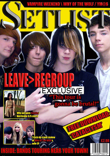
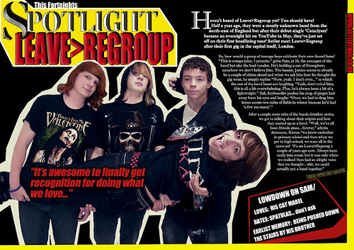
Photoshop - This time round I was more prepared for using Photoshop because of the preliminary task carried out earlier in the term but I still learnt masses about how to use it to get the effects I could picture in my mind. I learnt how to use the spot healing tool and airbrush the pictures so the people in the band's had clearer skin, also I changed the colour of Zac's hair slightly to make it more vibrant. I think i've learnt a lot about aesthetics from Photoshop as it allowed me to see what a large difference to the finished product in general when I changed the tint of the photo's to make them slightly more blue-ish or how a whole page can look a whole lot more balanced and professional by adding a border around some text for example. Being able to do such close analysis of the photo's I took made me more aware of how camera angles and the positioning of people in a photo really does have a large effect on a finished product. A good example of this was the picture of Leave>Regroup lined up and where 3 of the 4 are close to eachother, Jordan on the end was is leaning away slightly and it ruined the photo because he looked less of a band member than the others.
Overall, I have learnt a great deal of techniques and how to use many technologies I haven't had a chance to use before and I think this information will be useful for me in future when I have to put together a project.


 Windows Live Movie Maker - Although I'd had a little experience of Windows Movie Maker so knew the basics, I found the layout of this different and a lot harder to work with because I wasn't used to it. It's good that I used this to create videos for media though because now I can use it. I found it very simplistic and basic because it was essentially cutting and pasting clips next to each other with the option of adding music to it, but it was the only editing programme I had access to.
 Photoshop - This time round I was more prepared for using Photoshop because of the preliminary task carried out earlier in the term but I still learnt masses about how to use it to get the effects I could picture in my mind. I learnt how to use the spot healing tool and airbrush the pictures so the people in the band's had clearer skin, also I changed the colour of Zac's hair slightly to make it more vibrant. I think i've learnt a lot about aesthetics from Photoshop as it allowed me to see what a large difference to the finished product in general when I changed the tint of the photo's to make them slightly more blue-ish or how a whole page can look a whole lot more balanced and professional by adding a border around some text for example. Being able to do such close analysis of the photo's I took made me more aware of how camera angles and the positioning of people in a photo really does have a large effect on a finished product. A good example of this was the picture of Leave>Regroup lined up and where 3 of the 4 are close to eachother, Jordan on the end was is leaning away slightly and it ruined the photo because he looked less of a band member than the others.

